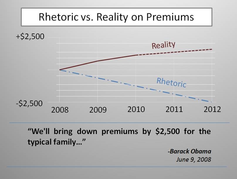
The Unaffordable Care Act in One Chart
As the White House is promising to release a series of graphs and visual aids during tonight’s State of the Union address, I’ll start the discussion by pointing out one chart that the White House won’t show – the Administration’s “progress” on reducing Americans’ health insurance premiums by $2,500 per family. Candidate Obama repeatedly promised during his campaign to lower health insurance premiums by $2,500 per year – yet President Obama not only signed a bill that forces Americans to buy health insurance, but also will RAISE individual health insurance premiums by an average of $2,100 per family. That the President signed a bill directly violating one of his central campaign promises illustrates the way the “Affordable Care Act” is more accurately named the UNaffordable Care Act – unaffordable for middle-class families struggling to pay their current premiums, hard-working taxpayers, and future generations of Americans who will bear the debt of trillions in new entitlement spending.
The graph follows below, and a compilation of quotes from candidate Obama promising a $2,500 premium reduction is available here.
