The Case for Medicare Reform in One Chart
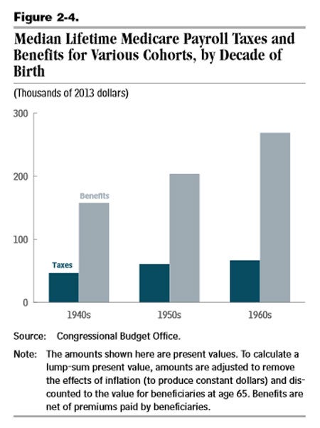
Last week’s release of the annual long-term budget outlook by the Congressional Budget Office (CBO) illustrates the need to control federal spending, and spending on health entitlements in particular. One chart from the report explains why the Medicare Part A trust fund could “be exhausted just beyond the coming decade,” according to CBO. Figure 2-4 demonstrates in visual form that the level of Medicare benefits being paid out vastly exceeds the taxes being paid into the system.
As the text accompanying the graph states:
Over their lifetime, beneficiaries born in the 1940s would, on average, receive about $160,000 in benefits (net of premiums paid) and pay about $45,000 in payroll taxes (both figures are expressed in 2013 dollars). Those born in the 1950s would receive, on average, about $205,000 in benefits and pay about $60,000 in payroll taxes, CBO estimates. And those born in the 1960s would receive, on average, about $270,000 in benefits and pay about $65,000 in payroll taxes.
To be sure, the CBO analysis comes with a major caveat. Medicare is funded directly—by the payroll tax—and indirectly—by general federal revenues that come from a variety of sources, most notably the income tax. The analysis above examines only the payroll taxes individuals “paid in” to the Medicare system, and does not include the portion of individuals’ income taxes used to fund Medicare, because, as CBO notes, those amounts “cannot be easily traced.”
That drawback notwithstanding, the CBO chart confirms prior Heritage analysis: The Medicare benefits most baby boomers are projected to receive vastly exceed the amount of taxes being used to fund the program. That fact, coupled with the growth in projected benefits for current and future generations of beneficiaries, illustrates why Medicare needs structural reforms in order to make the program sustainable in the long term.
This post was originally published at The Daily Signal.
